Bearish Persistence on the AAII Survey

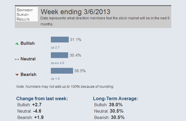
Despite the all time high this week on the Dow Jones Industrial Average, bearish sentiment actually rose 1.9% on the AAII Sentiment Survey to 38.5%, a full 8% above the long term average.

aaii

Bearish individual investors seem impervious to the new highs or the most recent 14.6% rally from $SPX 1353 on 11/15.

Extraordinary persistence.

Dow 36,001

I read with interest this piece entitled Dow 36,000 Is Attainable Again.

With the Dow making new highs, Kevin Hassett, who wrote the book Dow 36,000 back in 1999, is back baby and it is all very exciting. (I kinda have a woody.)

Furthermore, I believe this forecast, while it might appear crazy after all we’ve been through in the new millenium, might actually be too conservative.

That’s right. I’m looking for 36,001. Here’s my analysis:

djia


Reflexivity and New Highs

A quick note this morning about the new highs in the Dow and Transports.

These levels affect the way people think and there are reflexive aspects around corporate decision making and investor risk appetite especially if prices hold and markets continue higher over the course of the year.

Reflexivity, for those of you who are not familiar, is a concept applied to markets by George Soros, that describes the circular relationship between cause and effect.

Executives at large companies who observe the broad market making new highs and their own stocks doing well will have a tendency to grow more confident in the economy and their own businesses and confidence has been sorely lacking.

This, in turn, might lead them to be more aggressive in conducting business and, importantly, to do more hiring than they might have otherwise. More hiring would positively affect the economy, increasing consumer spending, confidence and the like.

We may also see reflexive investor behavior. The market goes up and people become more attracted to it as they observe others increasing their wealth. This, in turn, leads to more investors getting involved and further increases in equity prices.

These are only two data points in an incredibly complex environment but the potential reflexive aspects of new highs is worthy of mention.


Why Are Most People Terrible Investors?

iceberg

I just got an email asking me this question:

Why are most people terrible investors?

This is one of many answers…

Most people are propelled by their own fears and fantasies while having no idea that this is the case.

Freud called it the iceberg (or topographical) model. 90% of the iceberg is underwater. Its his representation of the unconscious mind and the things that we are thinking or feeling that we are unaware of for whatever reason.

Not only are you unaware, but these undetermined experiences are guiding your behavior without you even knowing it, especially when the unconscious fear or fantasy is being triggered.

Sure, there is some variability there, and some people are more self aware than others, but for the most part its about 90%.

What’s more, even if you raise awareness and figure out that you are scared shitless of losing money because your distant ancestors, the ones whose genetic make up yours is a descendant of, lived in a highly resource scarce environment, one that you could not even envision,  knowing that this is so and changing are two very different things.

Oh, One Other Thing – Beware People Telling You How To Cure Yourself of Being a Terrible Investor…

They have no idea what they are talking about.

Every time I read an article that explains why people are terrible investors (there are many reasons and my post only provides one angle), the social scientist or neuro-scientist or blogger/journalist reporting on the phenomenon snaps his finger at the end and tells you that now that he has explained to you why you are a terrible investor, you will be a much better investor.

This is ridiculous.

Here’s a quote from the Stanford Graduate School of Business Blog in an article titled Your Genes May Affect Your Financial Decisions that summarizes a study done linking genetic variation and risk taking.

“You’re not a slave to your genotype,” he said. “If you understand how it’s influencing your behavior, then you have a shot at changing that behavior.”

When I read this type of quote from the researcher, and they occur often, I find it so misguided that I have no choice but to question their research and how they contextualize their expertise back into the real world.

If you are genetically predisposed to having a food allergy, does your awareness of it cure you? No, it tells you to stay the fuck away from peanuts.

So, even awareness is overrated. Its a start but really its about your choices. Its where the training begins, not ends.


The Best of StockTwits Charts 03/05/13: Attending to Value & Price

This morning, we highlight a few of the more interesting studies from the StockTwits Charts Stream.

1. You Can’t Paint to the Sky

Over the past several months, chartists have compared most everything in the universe to Apple ($AAPL) as its fall from grace has been spectactular and impossible to ignore. From Kimble superimposing the $AAPL chart with the Eiffel Tower back in November and closer to the beginning of the slide to more recent comparisons with the Gold Miners Index ($GDX) which is also getting shellacked.

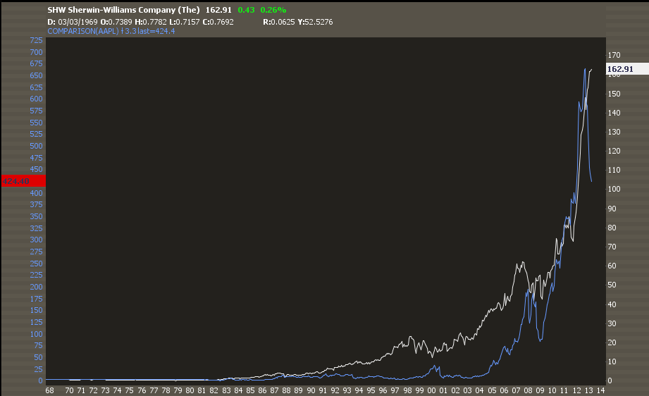
Most recently, @Ryknow compared the $AAPL chart with Sherwin Williams ($SHW).

aaplshw

This one is interesting though, not for what it implies about $AAPL but because of what it implies about $SHW. It has been a hell of a run for the paint maker, a proxy for the recovering housing market, but as the slope of the rise increases towards parabolic levels, something must give.

2. Copper and the SP 500

Last week, I showed a copper chart and noted how the metal continues to act poorly even as the US equity indices approach all time highs.

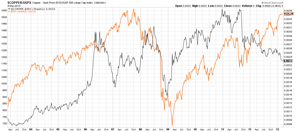
Darren Miller  (@psychtrader) posts an excellent comparison chart of the Sp 500 ($SPX) and Copper ($JJC) noting the divergence between the two.

spxcopper

Darren compares the current divergence with that of a similar one in 2006-2007. It should be noted from the comparison that the divergence can last quite a while and that the ’07 one resolved with a strong move to the downside for both.

3. Employing Value and Price

Despite much bickering between the schools, fundamental analysis and technical analysis can be employed in conjunction by investors who get the importance of each and plan well.

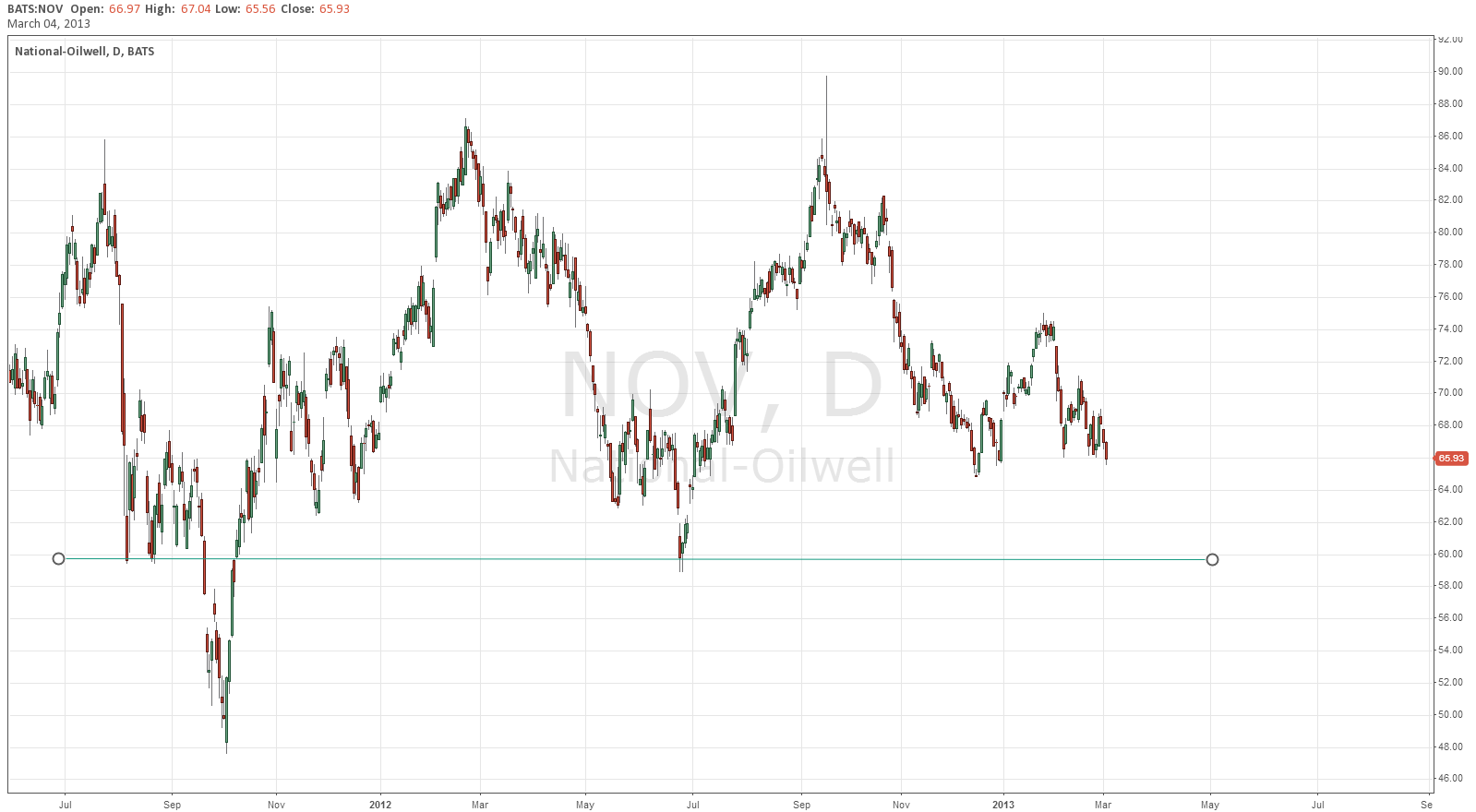
@Vlad_ggfinances does just that. He has been waiting to buy National Oil Varco ($NOV) based on value. Still, he uses technicals to help him determine an entry beforehand and to ensure that he gets the price he wants. He writes, “As soon as it gets to 60 I am buying been waiting for this.”

nov

Love this patience, discipline and attention to price as value!


The Best of StockTwits Charts 03/01/13: Warning Signs

This afternoon, we highlight a few of the most interesting charts from the StockTwits stream.

1. Where’s the Volume?

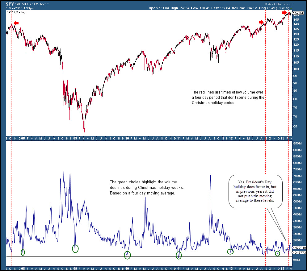
Christmas usually marks the period of the year when trading volume is at its very lightest. This makes sense as most trading desks thin for the season and as company related news lightens significantly.

So it is interesting to note that as the SP500 made its recent high up at 1530, trading volume was incredibly light and comparable only to Christmas season volume.

@hertcapital’s chart posted earlier this afternoon displays the details:

 spyvolume

It remains to be seen whether such anemic participation means that demand is finally drying up at these levels. That’s the implication for sure, though the 3 year year bull market manages to endure for the time being even as volume has been historically punk.

2. Apple Made (Another) New 52 Week Low Today

$AAPL closed down another 11$ (2.5%) to close the week at 430. This marks yet another 52 week low and its lowest close since January of 2012.

@Fibline’s weekly $AAPL chart puts the move from 705 to 430 in context showing just how little it has given up relative to its epic rally or, if you’re more the glass half empty type, how much more it has to fall. The bearish wedge (green dotted lines) is a nice touch.

appleee

3. Does The Market Have a Copper Top?

Can the global economy really recover and the US stock Market continue to climb without copper’s participation?

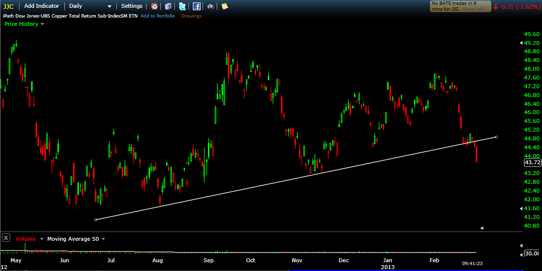
Earlier today, I posted this chart showing Copper ETN $JJC breaking its bullish trend line.

jjc

Copper is a key metal to watch because it is a proxy for industrial production and housing so to see it breaking down while US indices approach all time highs is, at the least, a divergence worth keeping an eye on.


Finding Your Trading Groove

If you are having difficulty finding your trading groove, turn down the tv and listen to this instead.


We Need a Miracle Videographer for The Social Investing: Digital Wall Street Panel at Social Media Week NYC!

smw

On February 20th, I will be a part of an amazing panel discussion moderated by Heidi Moore and joined by Josh Brown, Leigh Drogen and Michael Giles. We will be talking social finance and digital Wall Street.

The event sold out fast and we have been getting a bunch of emails from people who would like to attend.

What we would really love is for someone with the chops to broadcast and/or videotape the event to step up and help us out so that those who will not be able to join can still check it out. We will buy you drinks at the after party.

C’mon people, we need a miracle videographer!

Please shoot me an email if you are interested in saving the day at phil at stocktwits dot com.

Thanks.

Update: Gold Continues To Trade in a Narrowing Range

Getting  a few questions about gold here so here’s a quick update.

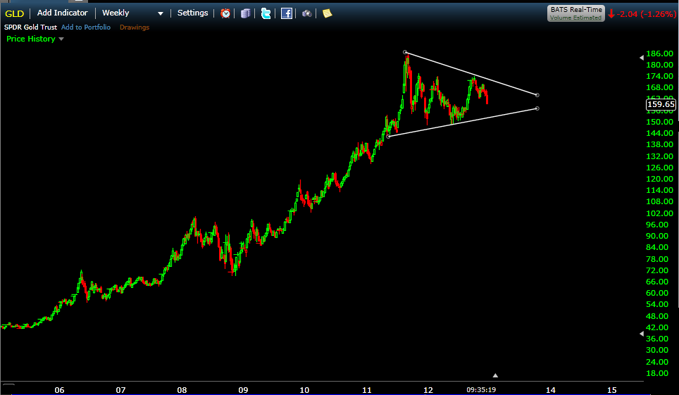
On a big down day in December (12/20), I posted this chart:

gld1220

And wrote:

Sure, $GLD is getting shellacked again here, losing 8% in 6 weeks & now the 200dma.

People are starting to whisper behind its back… Gold is the new $RIMM …

:)

Yet, within the larger context, gold’s just trading near the middle of the giant pennant of lower highs and higher lows that began forming after the blow off top in September of 2011.

Im looking for resolution of this pennant in 2013 but certainly not on this dipsy do…

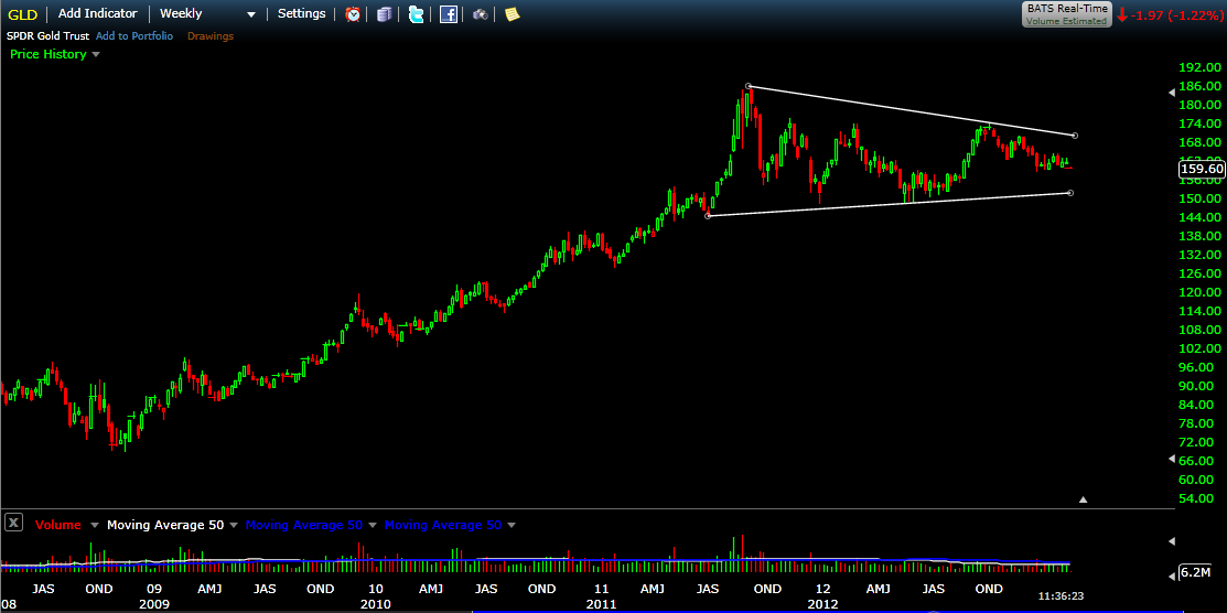
This morning its getting hit again and here’s an updated chart, this time a weekly:

gldwkly

$GLD is trading at exactly the same price it was trading on December 20th. The big move will come above or below this narrowing range and we are getting a bit closer to resolution but for now its more sound and fury signifying very little…


Load More Posts