As you are all likely aware, gold is getting crushed, now down 125usd though off last night’s lows in the futures markets.
There have been hundreds of charts relating to the metal posted to The StockTwits Charts Stream in the last 24 hours and many of them are excellent.
I am posting a small sample here and focusing mostly on comparison charts. My thinking is that gold intertwines with other markets (currency, bonds, equities etc) in a complex way and so when we see a move like we have Friday and today, the changes in these relationships occurring as a result are worth noting.
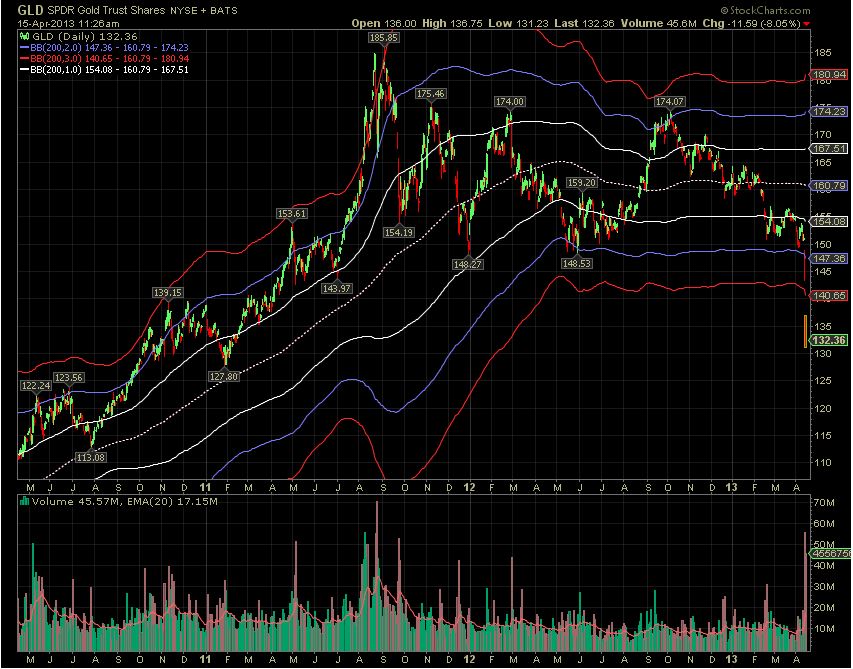
First, Tim Turrenne (@cyclentrade) compares gold’s behavior to its history and contextualizes the extremity of the recent move noting, “more than 3 standard deviations outside the 200 day moving average is very rare.” Indeed:
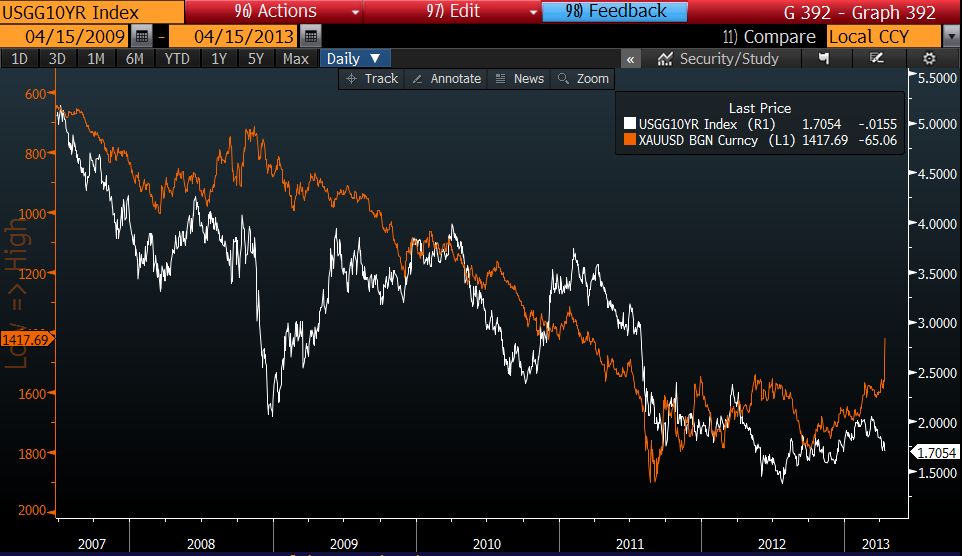
Next, Christopher Vecchio captures the recent divergence between the price of gold and the 10yr yield on a 6 year chart. He writes, “Gold decouples from US 10yr – are interest rates about to spike?” (note: the price of gold is inverted on this chart):
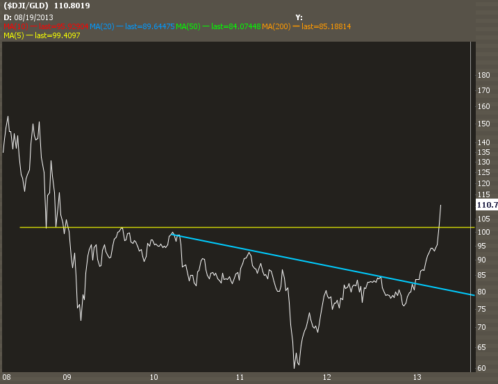
Steven Place captures the relationship between the Dow Jones Industrial Average ($)DIA and $GLD. He writes, “Dow Jones priced in $GLD now at the highest levels since the 2008 crash:”
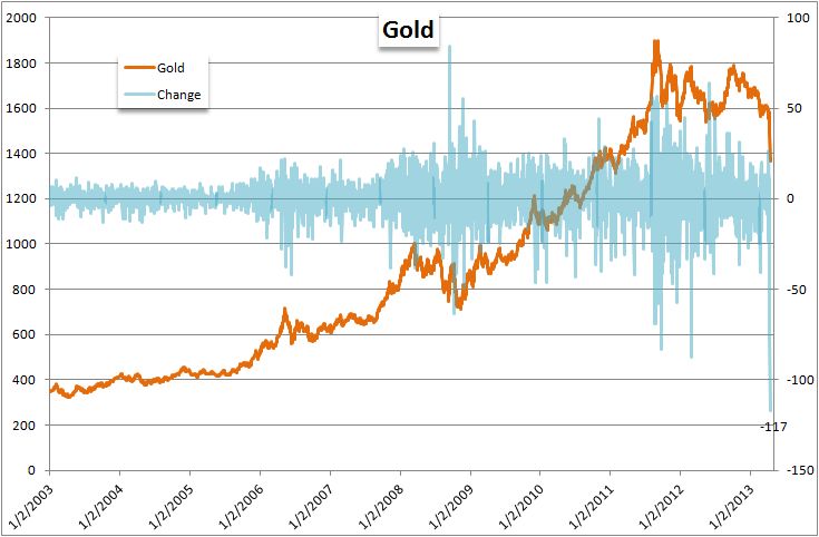
John Kicklighter measures “daily gold changes over the past decade” and this is by far the biggest:
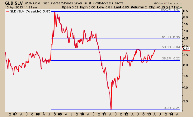
JC Parets compares gold and silver, “the $GLD and $SLV ratio is right at the 50% retracement of the huge 2008-2011 down move:”
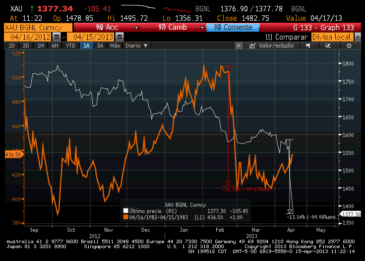
Jaime Bermudez compares the recent gold move to its 20% crash in 1983 to 2013:
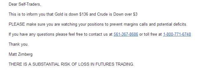
Last but not least, here’s an email @Trade2day1 received twice in the past two trading days from Optimus Futures. It suggests to me that traders are under extreme pressure with these large moves not only in gold but in crude as well:


