Zeroing In On The Profound Aspect of Social Networks

The market focused community of which I am a part has a tendency to parse every wrinkle in information and price behavior.

When we are involved with the trade, especially, we can get so close up, so tuned in to each detail, that it becomes difficult for us to recognize the much larger trends or broader implications of those trends as they unfold.

Nowehere is this more true than with $FB and, perhaps, some of the other social stocks like $YELP and $LNKD.

$FB, in particular, began trading earlier this year with huge fanfair and then the dissapointing price behavior became the well from which the media and market participants quenched.

This brings me to Clay Allsopp’s wonderful blog post titled Growing Old on Facebook. It begins,

There’s an entire generation where every photo, message, post, idea between adolescence and adulthood is cataloged on Facebook. Just click on the most recent picture and tap your left arrow key to see.

Wrinkles vanish, beards recede, and bodies contract and expand into the past. There’s all the embarrassing haircuts, forgotten friends, parties, love, heartbreak, it’s all there waiting to be rediscovered. New moments pile up every day, just itching for our future selves to find again.

Social tools are changing the way we relate with others and with ourselves over time, no doubt, and its a considerable shift. I bring this up completely apart from discounted cash flow models, chart patterns or sentiment analysis, but also to be contextualized within our theses as it is also a crucial part of an evaluation of $FB and these other names.

Head on over to Clay’s blog and read the rest of his excellent and well timed piece.


ReutersTV: How Bad Was The Research In Motion Report?

I sat down with The Globe and Mail’s Iain Marlow this morning to discuss $RIMM’s earnings report and the new Blackberry 10 scheduled for release at the end of January.

The G&M and Marlow in particular have been and continue to cover $RIMM better than any media outlet in my opinion given the Canadian background and the fine work they do in general.

Check it out:


Sure, Gold Is Getting Shellacked But…

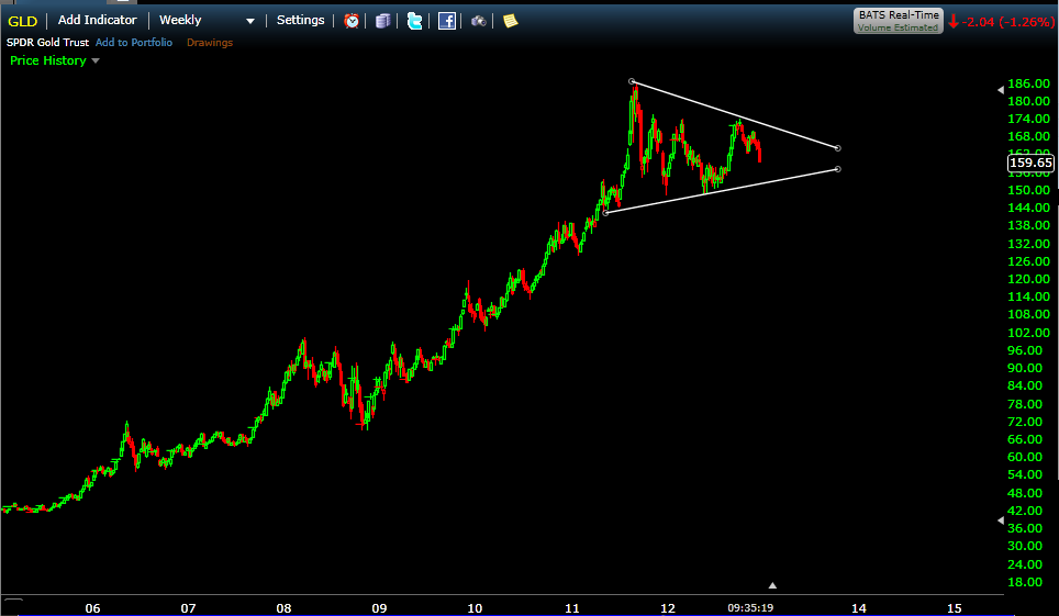
Sure, $GLD is getting shellacked again here, losing 8% in 6 weeks & now the 200dma.

People are starting to whisper behind its back… Gold is the new $RIMM …

:)

Yet, within the larger context, gold’s just trading near the middle of the giant pennant of lower highs and higher lows that began forming after the blow off top in September of 2011.

Im looking for resolution of this pennant in 2013 but certainly not on this dipsy do…

All Eyes on the Financials

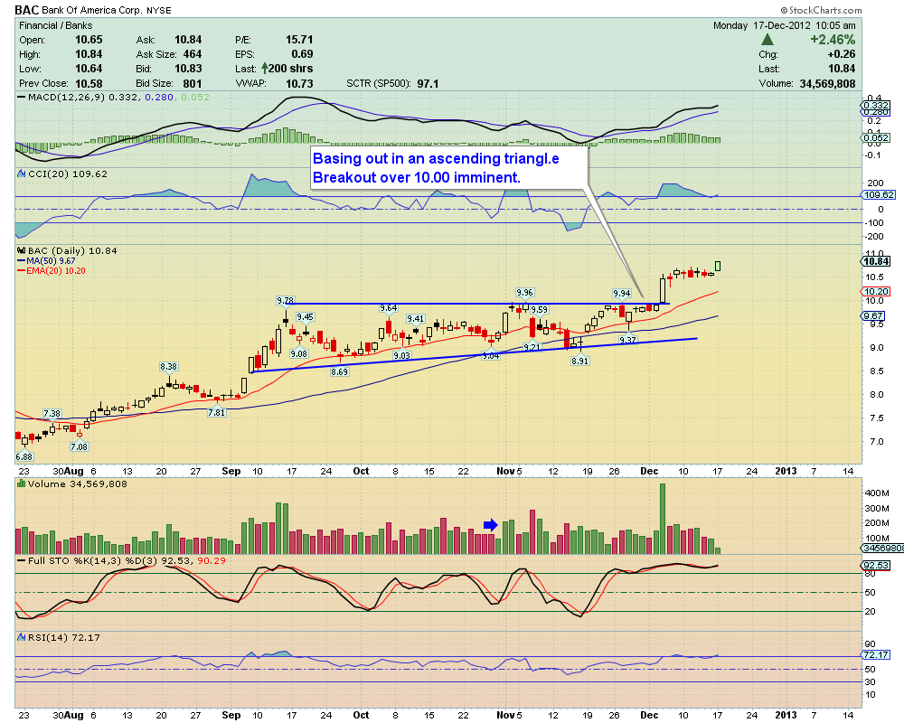
Two weeks ago, I wrote this Uncle Morty piece on $BAC when it was trading just below 10. The post included some excellent crowd sourced technical analysis courtesy of The Awesome StockTwits Charts Stream and the guys nailed it.

All eyes were on the stock and still it it broke out out above ten to 52 week highs and has consolidated nicely since then at higher levels.

Here’s ginsu sharp @traderstewie taking a more recent look and mapping the breakout and continued strength. Stewie notes, “Up a cool 8.5% since posting this chart over 1 month ago. Broke 10 and never looked back.”

Thanks Stewie and yup, $BAC was the first money center bank to go…

This morning I’m taking a quick look more broadly at the financial sector as I have noticed an increase in smart technicians very actively trading and monitoring the sector since $BAC’s move…

We’re at important levels here and as I mentioned in that previous post, the fins are a key sector to the market as a whole.

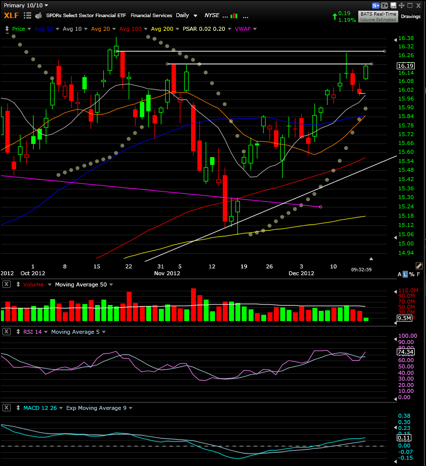
First, @KarSun01 looks at resistance on the $XLF. This is where we are now on the financials…

@KarSun01 notes that we are “testing resistance again” and from my vantage we’re at key levels right here right now.

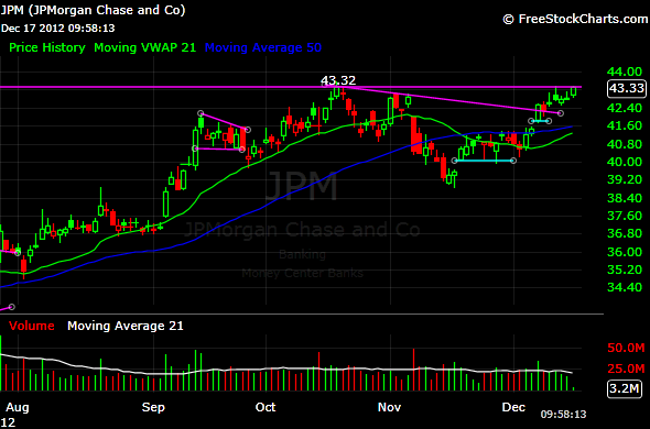
Next, @SunriseTrader, who anticipates breakouts extremely well, reports that he has been and remains long $JPM. He’s ahead of the move but again check the key levels here.

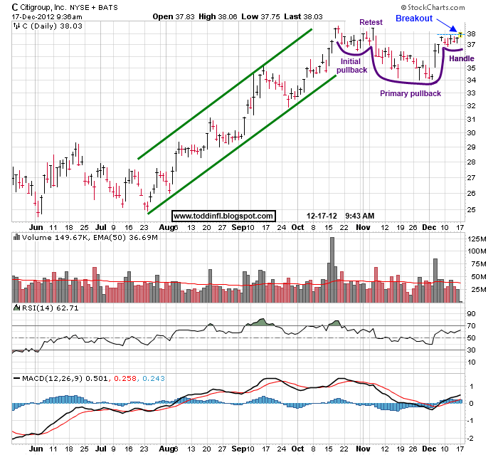
Next, @ToddinFL notes the cup & handle on $C and again, we’re right at a key level in this case 38ish.

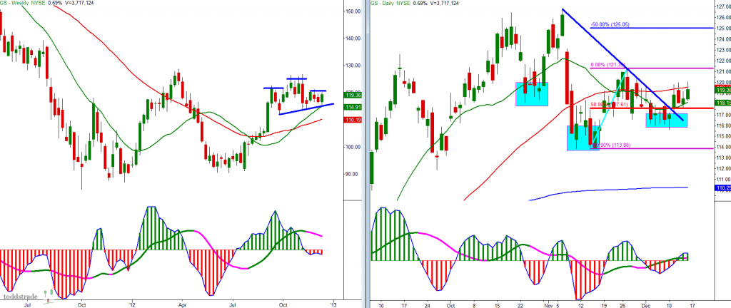
Finally, @toddstrade notes mixed signals across multiple time frames on $GS. A potential head & shoulders on the weekly and a potential inverse head & shoulders on the daily. Resolution might be the primary single stock market tell…

Periodically, traders and the media discount the importance of the financials.  This usually occurs during periods when they are not the leaders either higher or lower. I never buy those argument and until the laws of nature are revoked will key off of them. With the $XLF and these other names at key levels right here right now, keeping an eye peeled is especially important.


ReutersTV: The Apple VIX & How to Play It with Condor Options

With $AAPL falling 20% over the last 3 months, more traders are focusing on the increase in its implied volatility and how the $AAPL VIX might be analyzed.

Yesterday afternoon, I chatted with Jared Woodard (@condoroptions), who is an expert in all things $VIX related, about the implied volatility in $AAPL and how traders can incorporate it into their trading plans around the name:


The SP500 Has Held Up Extraordinarily Well During the Apple Shnide

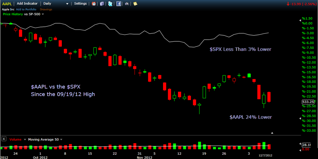
Apple Inc closed at an all time high of 702.10 on September 19. At the time, $AAPL was up 73% for 2012 and accounted for nearly 5% of the SP500 Index.

On the same date, the $SPX close at 1461 up 16% for the year and $AAPL accounted for approximately 20% of the gain.

That is to my recollection an unprecedented single stock skew for an index made up of 500 of the largest US public companies (Does anyone recall $XOM weighting at the late ’07 early ’08 highs?).

Since September 19th, $AAPL has fallen 24%.

Meanwhile, the $SPX has fallen only 2.8% and $AAPL has accounted for around 35% of the that move lower.

Institutions Were Buying Netflix Yesterday Ahead of the Disney Announcement

My pal Steve Hammer over at HFTAlert does phenomenal work identifying footprints in the tape.

You can also find his work on StockTwits and his chart stream there is among the most valuable on the site as he identifies buying and selling pressure imperceptible to the naked eye.

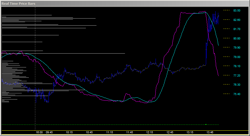
Yesterday, Steve posted this $NFLX intraday chart which shows his market pressure accumulator and the stock price.


 I shot Steve an email asking him for a bit more color around this chart and here is what he sent me:

The $NFLX market pressure accumulator, which measures one aspect of demand, started rising at 12:15, then accelerated as the price of $NFLX slowly declined.  A rise of this magnitude is significant because only institutional interest can drive the Accumulator this strongly higher.  At 1:46 the shares began reacting to several rumors and rose sharply.

Information leaks to big money all the time. We all know this and sometimes identify clues in the options data beforehand.

Steve finds it in the tape which is pretty awesome.


Even My Great Uncle Morty Is Watching This 10 Area on Bank of America

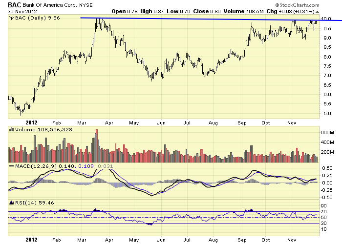
This 10 area on $BAC is one of the most watched levels in the market now.

This makes sense as it is a big level for the name having flirted with it in March and then edged close to it 3 or 4 times over the past few months.

$BAC also has larger market implications as a move taking out the 10 level would be bullish for financials ($XLF) which is a key sector when gauging the health of the broader market.

Contrarians espousing the watched pot never boils theory might note that because so many are focused on $BAC, it will not do the obvious thing but I think that view risks becoming conventional and therefore contrary to the contrary indicator.

The thing to do here in my opinion is follow price. If $BAC breaks higher on volume and follows through it will have bullish market implications and if it fails will be a negative data point. A close above 9.94 would be a 16 month closing high and an intraday move above 10.10 would be a 16 month high print.

In the meantime, here a few of the cleanest charts posted to StockTwits which capture past behavior of the stock across multiple time frames:

First, Keith Kern with a 1yr daily shows us the level everyone is watching.

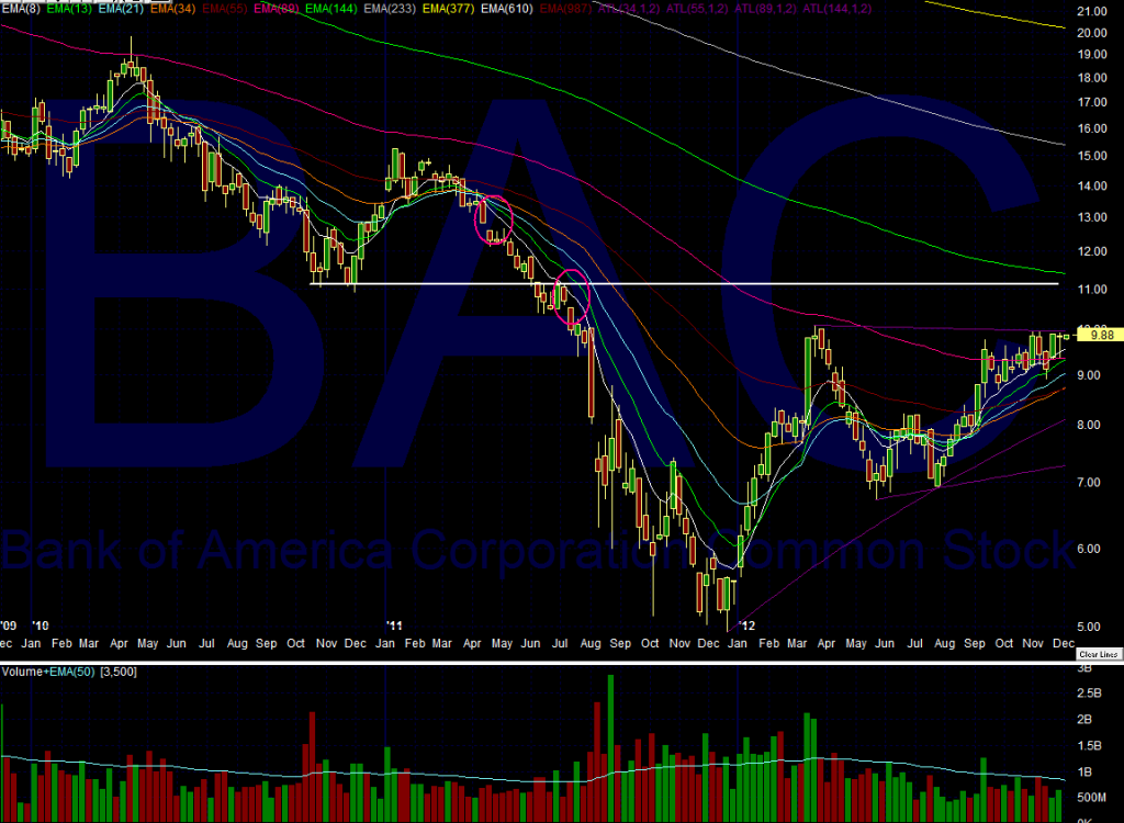
Next, Augur provides a 3yr weekly view including potential resistance levels near 11:

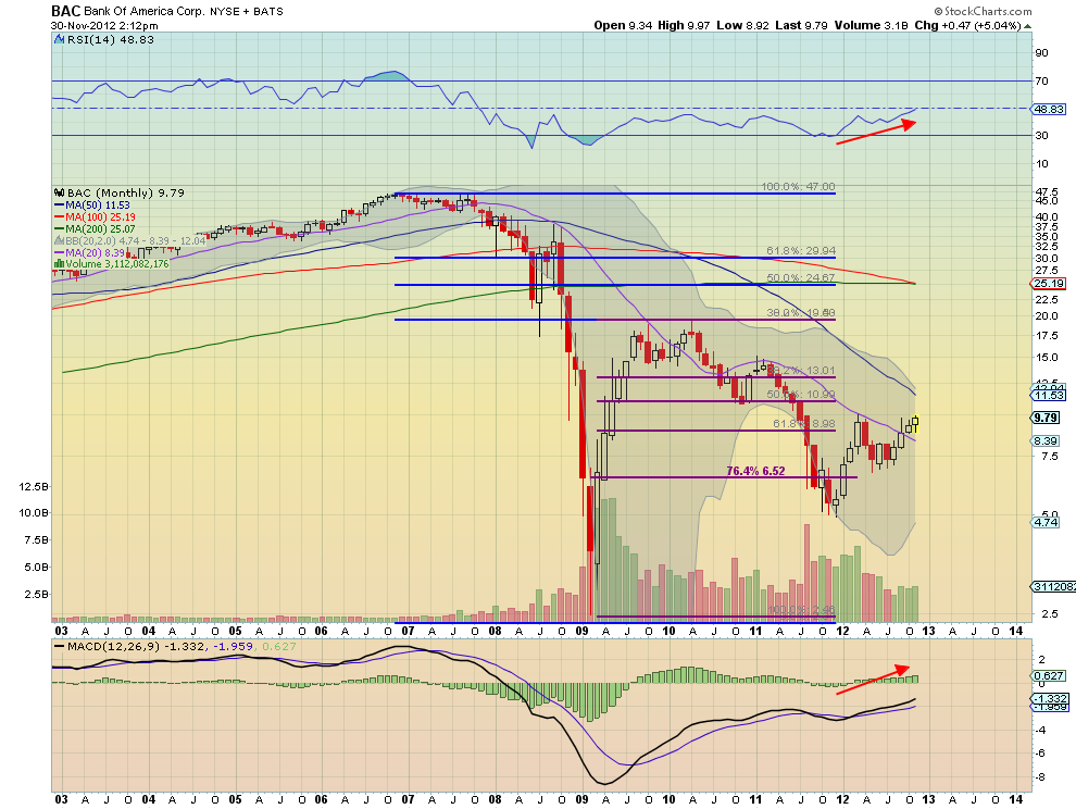
Last, Greg Harmon posted this 10yr monthly chart which provides Fib levels from the pre financial crisis top to the near end of the world bottom. 11ish also key here…


Load More Posts