My pal Brian Shannon (@alphatrends on StockTwits) is an innovator in the study of price behavior and his book on multiple time frame analysis is simply a must read.
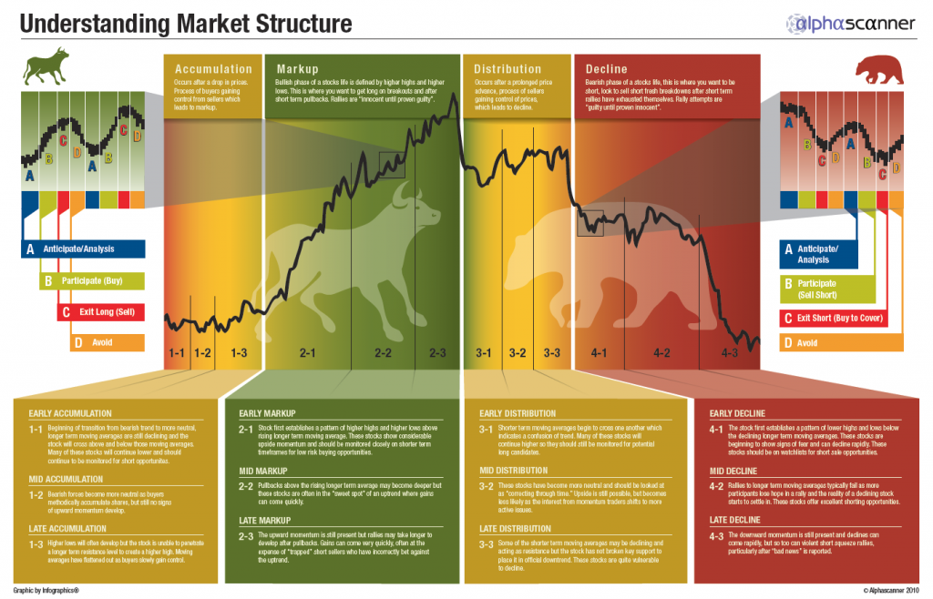
In Brian’s market structure model, he breaks the long term asset price trajectory down into 4 stages two of which are bullish (accumulation and markup) and two of which are bearish (distribution and decline).
He then goes on to organize each of these stages into 3 phases in order to more closely assess an asset’s position in the cycle with more granularity and over shorter time frames.
If you have never done so, spend some time with this graphic Brian created:
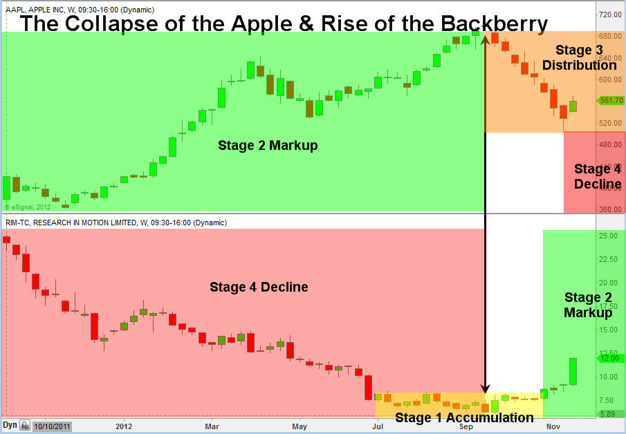
Yesterday on StockTwits Charts, Chris Vermeulen from The Gold and Oil Guy Newsletter posted this gem which applies Brian’s Market Structure model to two of the most discussed stocks in the universe.
The result is a killer graphic that some might find preposterous.
Chris graphs the Apple Inc and Research in Motion charts onto the Market Structure Model and finds that $AAPL is in Stage 3 Distribution while $RIMM is coming out of Stage 1 Accumulation and into Stage 2 Markup.
I am guessing that some will find this preposterous because $AAPL has been one of the greatest performing stocks in history as $RIMM, an early darling of the mobile boom, has fallen down and until very recently, the price behavior appeared potentially terminal.
From my vantage, that’s just the point.
The interaction between sentiment and price behavior is counterintuitive because we humans are emotional animals with short memories.
During Stage 3 Distribution, everyone still loves a stock because it has treated them so well in the near past while during Stage 1 Accumulation, arguably the best time to buy, a stock is hated due to its own recent performance.
Even with the road map, it feels so wrong.


