Don’t Forget: Amazon Is the Master of Losing Money to Gain Share

Since the launch of the Kindle Fire, I am reading everywhere that Amazon will lose 50$ per unit.

The reaction to this from some of the smartest guys on my stream is negative and questioning the strategy and the economics of taking losses on the hardware.

Those who are bullish argue that Amazon will make up for it by selling the content to the device (and subscriptions) and also gain an advantage by being able to measure the surfing and shopping behaviors of their customers via Amazon Silk.

 But there’s one key factor neither side has brought up here.

Amazon is the undisputed world champion of growing share by taking a loss on every transaction.

They took losses for years first on books and then on a widening variety of products in order to do it. They employed this strategy more effectively than any company in the history of commerce and scaled while armchair detractors predicted their inevitable demise.

Recall the cover of Barrons from the 90’s with the header Amazon.Bomb?

Back then though, Amazon really was fighting for its life and Bezos was taking an existential gamble. Big difference because now they are a much larger and financially healthier company with more resources while the tablet market is more compartmentalized.

So this is relative child’s play

What a winner.

$AMZN

Most Will Not Change Banks or Behaviors Over New Debit Card Fees

Much to do today from those criticizing new debit card fees on the way from $BAC, $WFC, $JPM and others.

While I applaud John Welsh for pulling money from a bank he was dissatisfied with, most will not act so assertively.

People remain with the same bank for years and changing is a pain in the rear end.

Even as people might dislike and curse their banks, they also grow more comfortable over time with them and their perceived safety increases with familiarity.

Others won’t even notice the fee.

This is how banks already get away with nickel and diming accounts on a monthly basis. They are well aware of the inelasticity.

People might complain but most will never act. How many people really moved to Canada after Bush got elected?  Remember that one?

You can call this the status quo bias or whatever but its just reality.


The Orioles Spoil The Red Sox Season and Frame Dependence

I’m mostly posting this video because I love seeing the Orioles spoil the Red Sox season in one inning even though they finished the year at the bottom of the AL East.  I also love that the guy filmed his tv with a video camera.

But most of all I love how the Orioles players run on the field jubilient after the game winning hit as if they’d won the World Series even though they finished the year 69-93, the 4th worst record in baseball.

The emotional experience associated with gains and losses is frame dependent so with the $SPY up 8 here after opening up 25, it only feels like a loss.

If we had opened down 25, we’d all feel wonderful trading up 8 here.


SFO Magazine Webinar: How StockTwits Can Help You Trade Better

 Good morning kids.

On Wednesday, September 28 at 11:30AM Eastern, I will present a webinar entitled How StockTwits Can Help You Trade Better in conjunction with SFO Magazine.

You will get the lowdown on how to find the best traders on StockTwits who share their ideas openly and how to zero in on the setups that match your own trading style.

Register Here

This will be great for traders who are new to StockTwits or who have only been using it a short while.

The Tao of Missing a Trade

Whichever the way the wind blows,
Whichever the way the world goes,
Is perfectly all right with me!

– Smullyan

When you don’t care about missing something, it makes it so much easier not to miss it.

This is natural law or Taoist as Smullyan might say. Some are born understanding this while some learn it in time while still others never quite manage to figure it out.

In trading, missing the trade gracefully is as much a part of the craft as executing.

The beauty of it is that there is always another setup coming around the bend so the missed trade is really nothing more than one more opportunity not to chase.

Google Trends Confirms Huge Public Interest In Gold

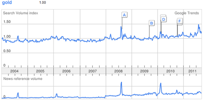
The above chart shows the long term global Google Trends for keyword gold for both search volume and news reference volume.

The top table showing search volume is based on relative scaling meaning that the data is scaled to the average search traffic for your term (represented as 1.0).

The spikes from mid 2008 and Q1 2010 are both misleading in that they coincide with The Olympics and account for frequent mention of the term gold medal.

The current and prolonged increase in search volume is by far the largest ever and also shows that global searches for the term have increased much more than news references. Thus, despite the sharp increase of media focus, broader public interest appears to far surpass it.

$GLD $GC_F

Help Me Name This Wine

I need a great name for this wine.

My wife and I made a case of it last year with friends at California Wine Works and we finally bottled it recently. We will need to wait another year before we can drink it but I would love suggestions and even label designs.

If we use one of the suggestions, I will send a bottle to whoever came up with it.

(Please put your suggestions in the comments on this blog so I can track them and not via StockTwits, Twitter, or email.)


The Wedbush Second Internet Report: Facebook, Twitter and Google+

Thanks to Lou Kerner at Wedbush for the permission to blog the excellent report he and Michael Silverstein put together.

The latest Second Internet Research Report from Wedbush came out this past week and while the public markets were crashy some might have overlooked the critical data and analysis relating to the social web and the internet in general.

Some key takeaways…

Google+ Slows After a Monster Launch

Multiple data sources suggest that Google+ ($GOOG) posts per day have decreased by a third. (Figure 4 on page 3 of the Wedbush research embedded below is striking in this regard and a must view.)

The followers added of the most popular Google+ accounts is also decelerating substantially.

In my opinion, it is too early to tell whether these posts per day and follower metrics are ominous. It seems natural that there would be a lull following the surge associated with such a huge release as social network consumers settle back into habitual usage patterns and only more slowly develop new ones. Nevertheless, the research does identify these critical variables which require close observation over time for signs of stabilization or further deterioration.

The +1 button is “scaling rapidly” and is now available on more than 1 million websites. (+1 launched June 1 of this year.)

Nielsen Data and Time Spent Online: Facebook Dominates

The report confirms Facebook’s ($FBOOK) increasing dominance of time spent online. The numbers here are astonishing with more than 40% share among top ten internet brands.

Yahoo! ($YHOO), despite its considerable and chronic organizational problems, still maintains second place on this metric, which, from my perspective, hints at the potential given improved leadership and more effective monetization strategies. (I am long $YHOO stock and you can find my rationale here).

Social networks now account for 22.5% of time spent online up 42% from 2 years ago.

Twitter’s Growth

Twitter is growing fast across metrics which supports “more aggressive” monetization efforts.

Tweet volume has more than tripled from a year ago to 230m per day.

More than 50 million log in to Twitter daily.

Read the full Wedbush report below:


Gold Price Behavior: Footprints at the Scene of the Crime

Forensic psychologists have learned that the best predictor of future behavior is past behavior. Those with a criminal history are most likely to run afoul of the law again.

For technicians historic price behavior similarly provides clues to the future.

Over the past month, 100s of $GLD charts have been posted to Chartly some of which might help us better recognize patterns which have and will continue to occur.

The following is a summary of telling charts from the Chartly gold stream for review which might assist students of price behavior in recognizing similar blow off patterns as they are occurring in other assets. (This is only a smattering of the excellent charts posted and so for those who seek a more thorough post mortem, I highly recommend spending some time perusing the complete Chartly stream for $GLD.)

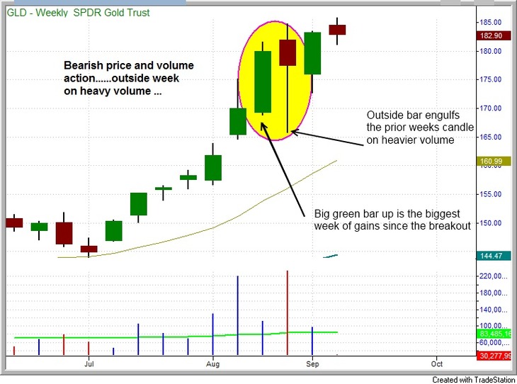
Footprints at the scene of the crime….

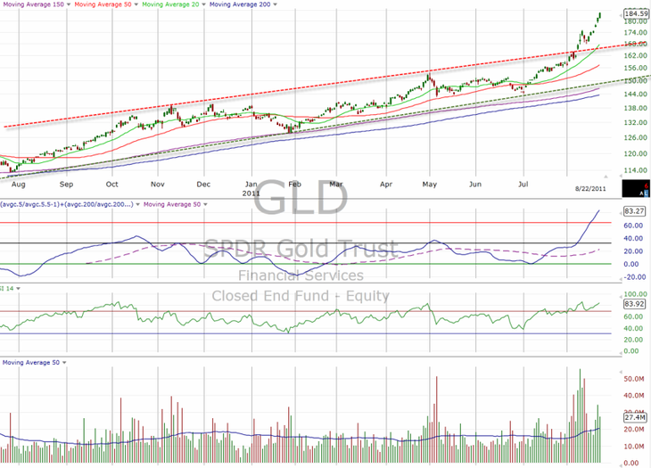
On August 22, @Global_Trader captured gold’s break above the long term bullish trend channel – evidence of historically abnormal price acceleration.

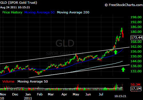
@puck2 took a snapshot only 2 days later with the same trend line but also capturing the first 2 precipitous red daily candles.

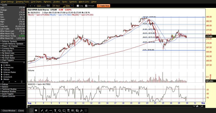
A week later (Aug 29), @stockdemons notes the failure at the 61.8% retracement drawn from the Aug 22 intraday peak to the Aug 25 intraday low.

 On 9/7, @MorpheusTrading observed 2 telling weekly candles denoting distribution:

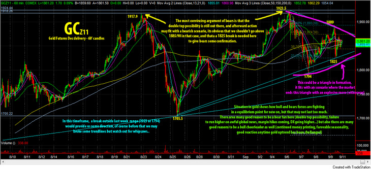
On 9/11, @TheEnergyTrader beautifully details the double top and “fight for equilibrium” on the hourly:

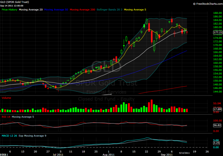
On 9/14, @alfietrade notes the first full daily candle in over 2 months below the 20 day moving average:

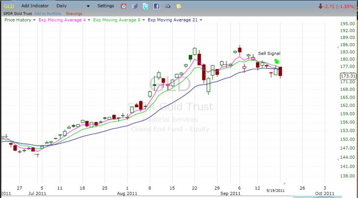
On 9/20, The @FibLine is all over the break down thank you very much:

And a bunch of good ones from yesterday…

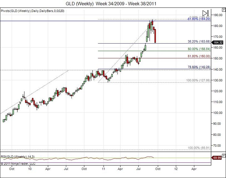
@StockTiger lays out long term fibonacci levels on the weekly:

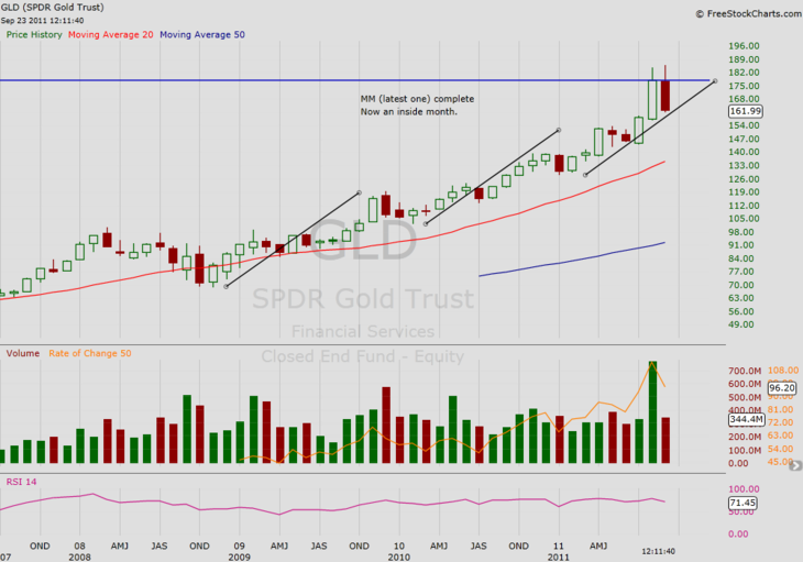
@1nvestor adds even longer time perspective on the monthly and puts the magnitude (or lack thereof) of the sell off into historical perspective:

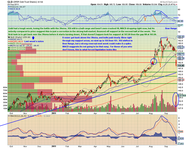
And finally, @gtlackey details the damage done:

As mentioned above, the complete Chartly stream for $GLD over the past few months is well worth closer inspection and those embedded above are only a small sampling.

In addition, past behavior is by no means a perfect predictor. Nevertheless, close inspection of a blow off and the subsequent trend break are well worth the time.

Load More Posts